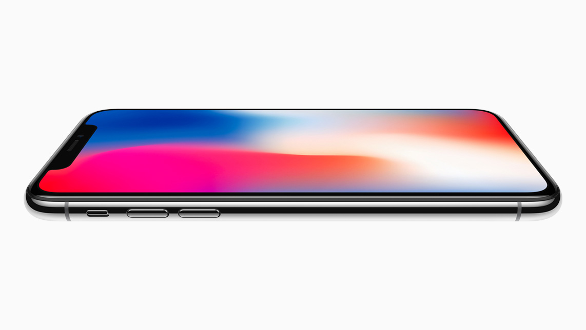
In memory of the notch turning five years old this week, we thought we'd look back at the history of the iPhone's display bezels and how they have evolved into the pill-shaped cutout it is becoming today.
The Thick Bezel Era
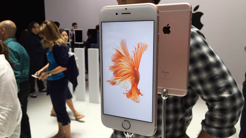
For the first decade following the iPhone's 2007 debut, all iPhones featured relatively thick bezels at the top, bottom, and sides of the display. The bezels were either black or white, depending on the color of your device. The bezels were particularly thick at the top and bottom, given the need to house the front-facing camera, earpiece, and the Home Button, which gained Touch ID in 2013.
Throughout those initial years, Apple hardly touched the bezel design around the iPhone's display, keeping the thick "forehead and chin" bezels as displays gradually grew from 3.5 inches in the first few generations to as large as 5.5 inches with the "Plus" variants of the iPhone 6, 6s, and 7. It wasn't until 2017 that things started to radically change.
Say Hello to the Notch
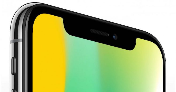
When Tim Cook announced the iPhone X at the Steve Jobs Theater in 2017, he used Apple's iconic "One more thing" phrase to mark the unveiling of the most significant redesign in the iPhone's history. The iPhone X introduced several new features to the iPhone, with the most notable being Face ID housed in a new notch that protruded into the top edge of the display.
With that significant change to the iPhone's display, Apple had to rethink how iOS handled content. The new design also meant that third-party apps needed to be updated to support the notch and be sized correctly for the new display. The notch remained a key design element of the iPhone for four years until it was ever touched again.
The Notch Gets Smaller
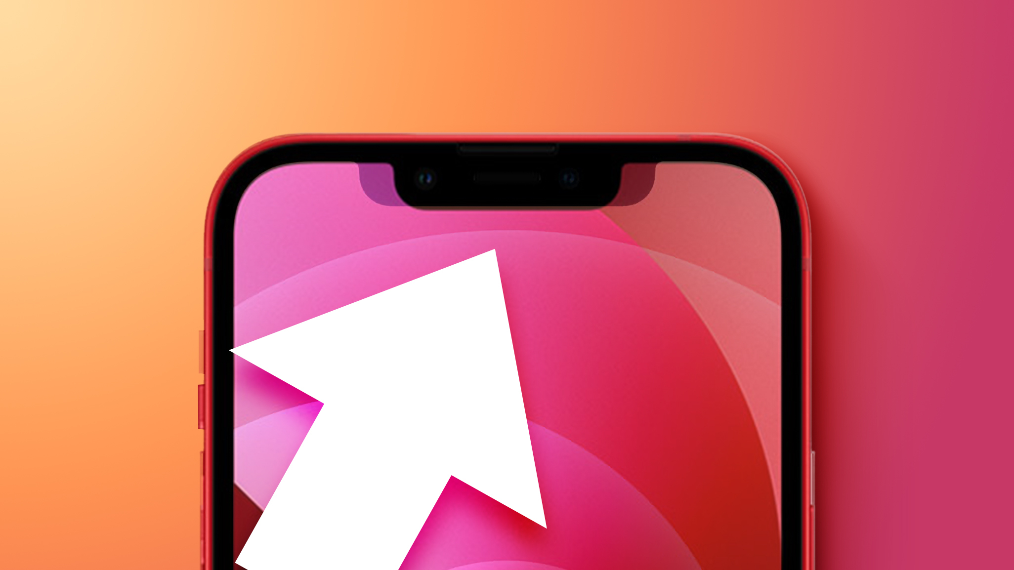
With the notch remaining essentially unchanged through the iPhone X, iPhone XS/XR, iPhone 11, and iPhone 12 generations, Apple finally managed to reduce its width with the iPhone 13. The notch on the iPhone 13 was made smaller in width but slightly taller. The change was a subtle one, but it emphasized Apple's efforts toward minimizing and ideally removing the notch, which would see another significant step a year later.
Welcome to Dynamic Island
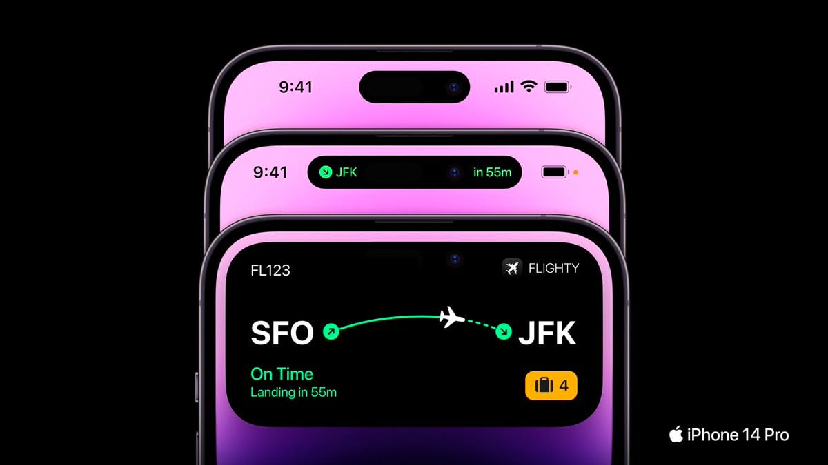
Five years after the notch's debut, Apple is finally moving on, upgrading the notch on the latest iPhone 14 Pro and iPhone 14 Pro Max to a pill-shaped cutout separated from the display bezel. While the cutout may look like one large pill-shaped display intrusion, it is actually two separate cutouts digitally merged and hidden within the iOS user interface through a feature Apple calls Dynamic Island.
Dynamic Island is an entirely new way to interact with the iPhone that integrates the pill-shaped cutout into the iOS experience by moving alerts, notifications, and other information to the top of the display and around the cutout, which digitally resizes to respond to what's being displayed. Dynamic Island has received praise since its unveiling last week, with some calling it the "best design work from Apple in years."
What's Next?
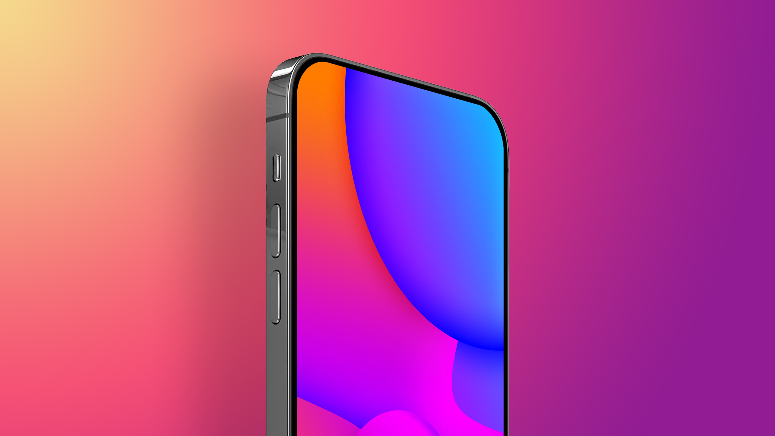
With the shift to a pill-shape and hole-punch cutout on the iPhone 14 Pro and iPhone 14 Pro Max, the question becomes about what comes after the Dynamic Island. While the end goal may be a fully unintrusive design with no notch or cutouts, that may be far out in the future until the technology to adequately hide the various cameras and sensors beneath the display exists.
Rumors currently suggest that Apple is planning to bring Dynamic Island to the standard iPhone 15 and iPhone 15 Plus models next year as the feature trickles down from the highest-end models, so it seems likely that Apple's notch replacement is here to stay for at least a few more years. What would you like to see as the next major design change on the iPhone? Let us know down in the comments.
Tag: Dynamic Island
This article, "A Walk Down Memory Lane: Evolution of the iPhone Display Bezels and Notch" first appeared on MacRumors.com
Discuss this article in our forums
0 comments:
Post a Comment