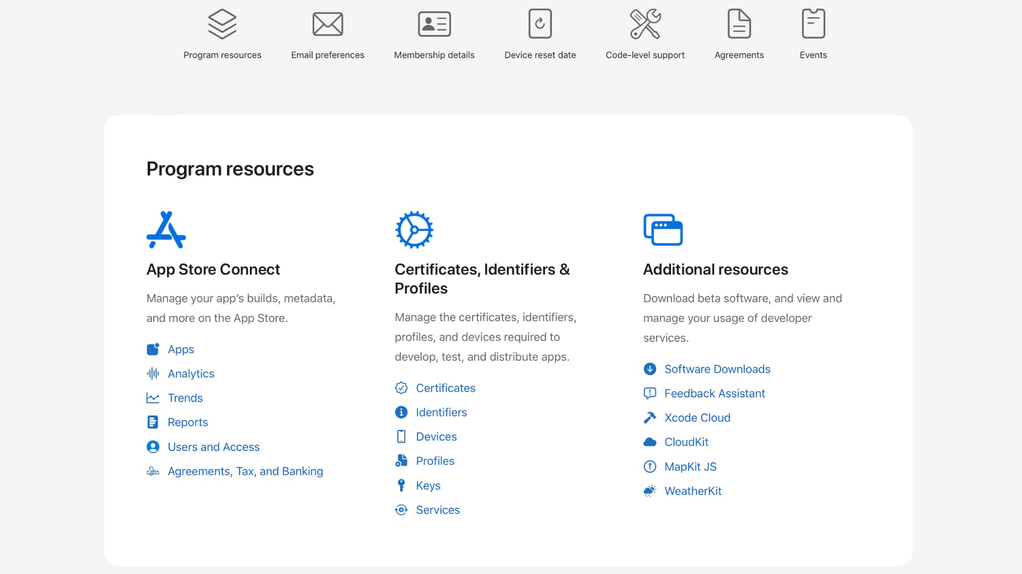
While the prior version of the website had a side bar for navigation, the updated site features a top navigation bar with access to program resources, email preferences, membership details, code-level support, agreements, and events.
All of the same information can be accessed by simply scrolling down, and with most of what's needed right in program resources at the top, it should be quicker and easier for developers to find the tools that they're looking for.
Program resources includes App Store Connect information and one-click access to apps and analytics, plus it has software downloads and certificates, identifiers, and profiles for testing and distributing apps.
There are quick access tools for managing an Apple developer account, receiving emails and notifications, and using Technical Support Incidents for code-level support for Apple frameworks, APIs, and tools from an Apple engineer. The site is limited to developers and requires an Apple developer account to access.
(Thanks, @alixrezax!)
This article, "Apple Gives Developer Account Page a Design Refresh" first appeared on MacRumors.com
Discuss this article in our forums
0 comments:
Post a Comment