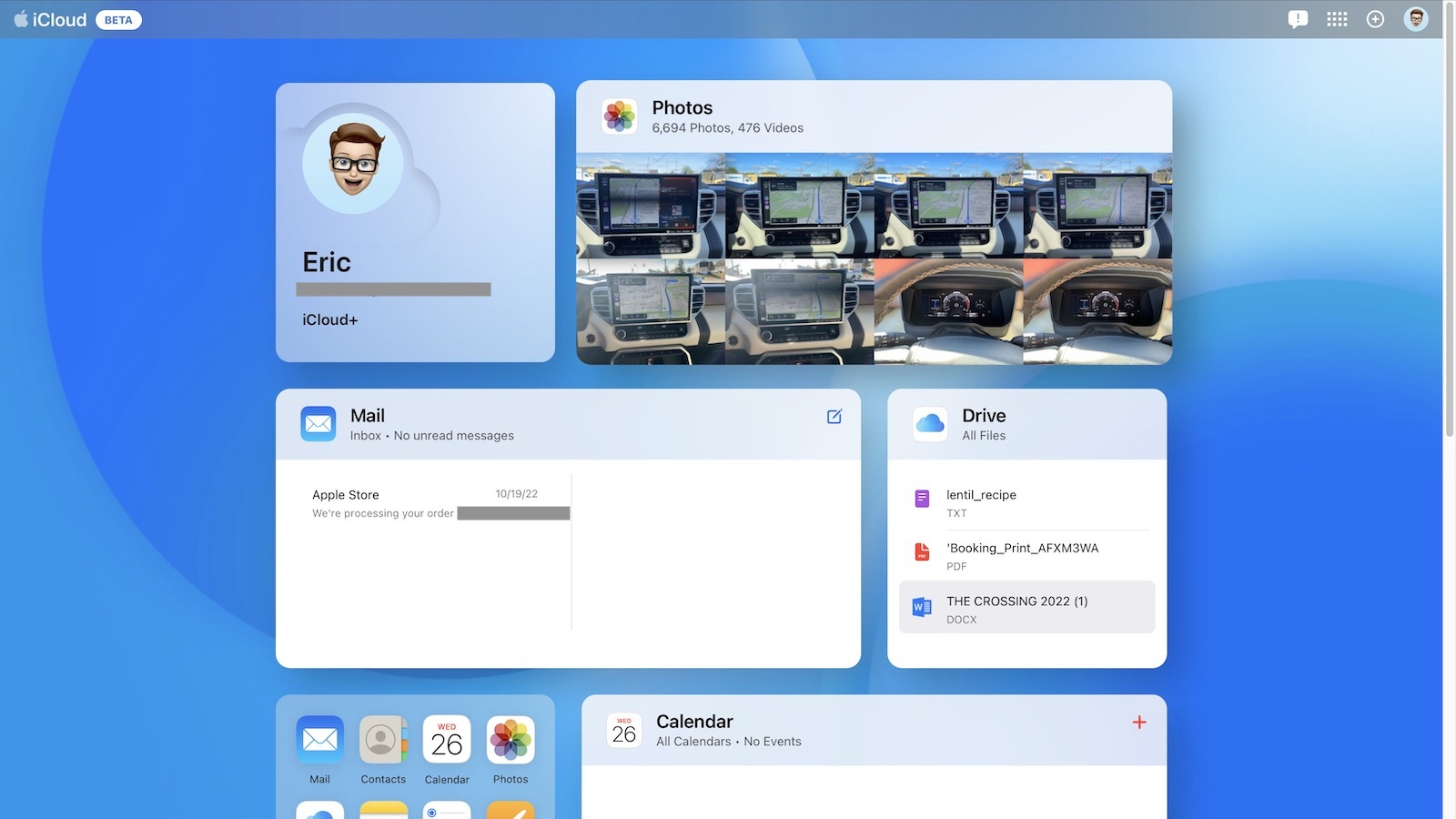
The updated design is a notable departure from the current iCloud design, showing full tiles with previews for Photos, Mail, iCloud Drive, Notes, and more, on a customizable Home page.
You can choose the apps that you use most for the iCloud Home page, selecting from all of the above listed apps as well as apps that include Pages, Numbers, Keynote, and Calendar.
Apple slightly redesigned some of the apps, tweaking toolbars and button locations for a more streamlined experience.
Anyone can see the new iCloud interface by visiting the beta site. It will be in testing for some time, and after Apple works out any bugs with the design, the new look is likely to expand to the main iCloud website.
(Thanks, Tim!)
This article, "Apple Introduces New Test Design for iCloud Website" first appeared on MacRumors.com
Discuss this article in our forums
0 comments:
Post a Comment